deyoungsters Studio — de Young Museum, San Francisco (Tellart, 2018)
Winner – IDSA International Design Excellence Awards 2020: Environment, Silver
Winner – 2019 SEGD Global Design Awards Merit Award
Winner – Core77 Design Awards 2019: Visual-Communication
Notable – Core77 Design Awards 2019: Built-Environment
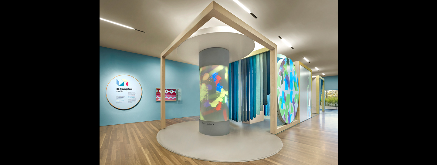
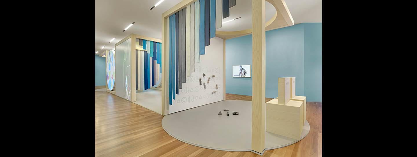
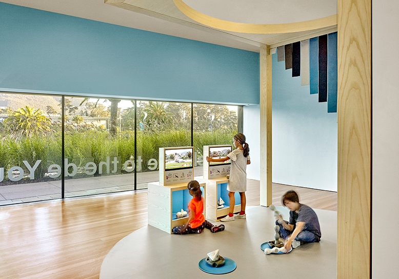
deYoungsters Studio is a permanent interactive children’s space at the de Young Museum in San Francisco. I served as Tellart’s lead technologist on this project, working closely with Yves Béhar and his studio, Fuseproject, who designed the original concept.
For this project, the de Young Museum tasked Tellart with bringing life to their concept of teaching children aged 3–10 core aspects of art-making through free, non-directed play. After R&D and prototyping phases, we developed the interactive experiences, refined them after multiple rounds of user-testing, and built out the final space.
As technical lead, I was responsible for building the system-architecture, designing network and power diagrams, creating electrical schematics and floor plans, performing load calculations, and developing software for four out of the five modules. From initial design to final installation, I was directly involved with each piece of technology in the space.
The experience features five different interactive modules, each with its own learning directive.
Color
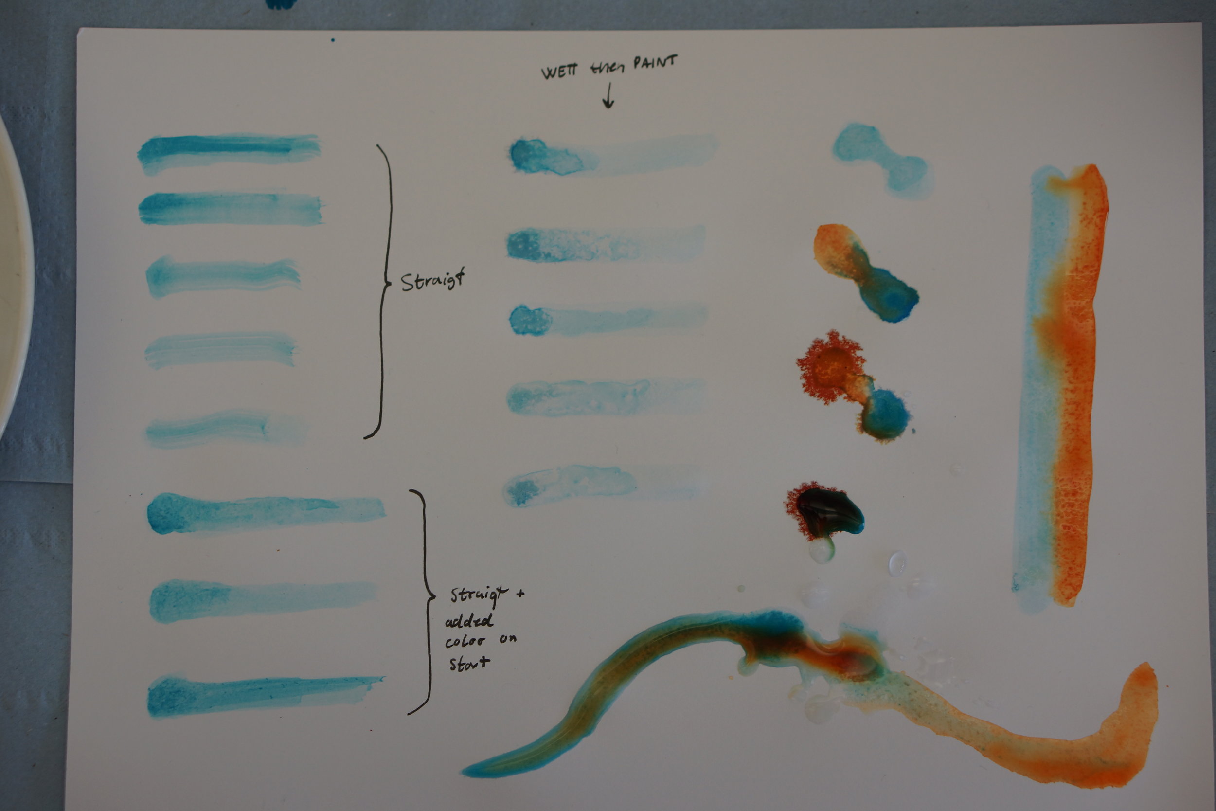
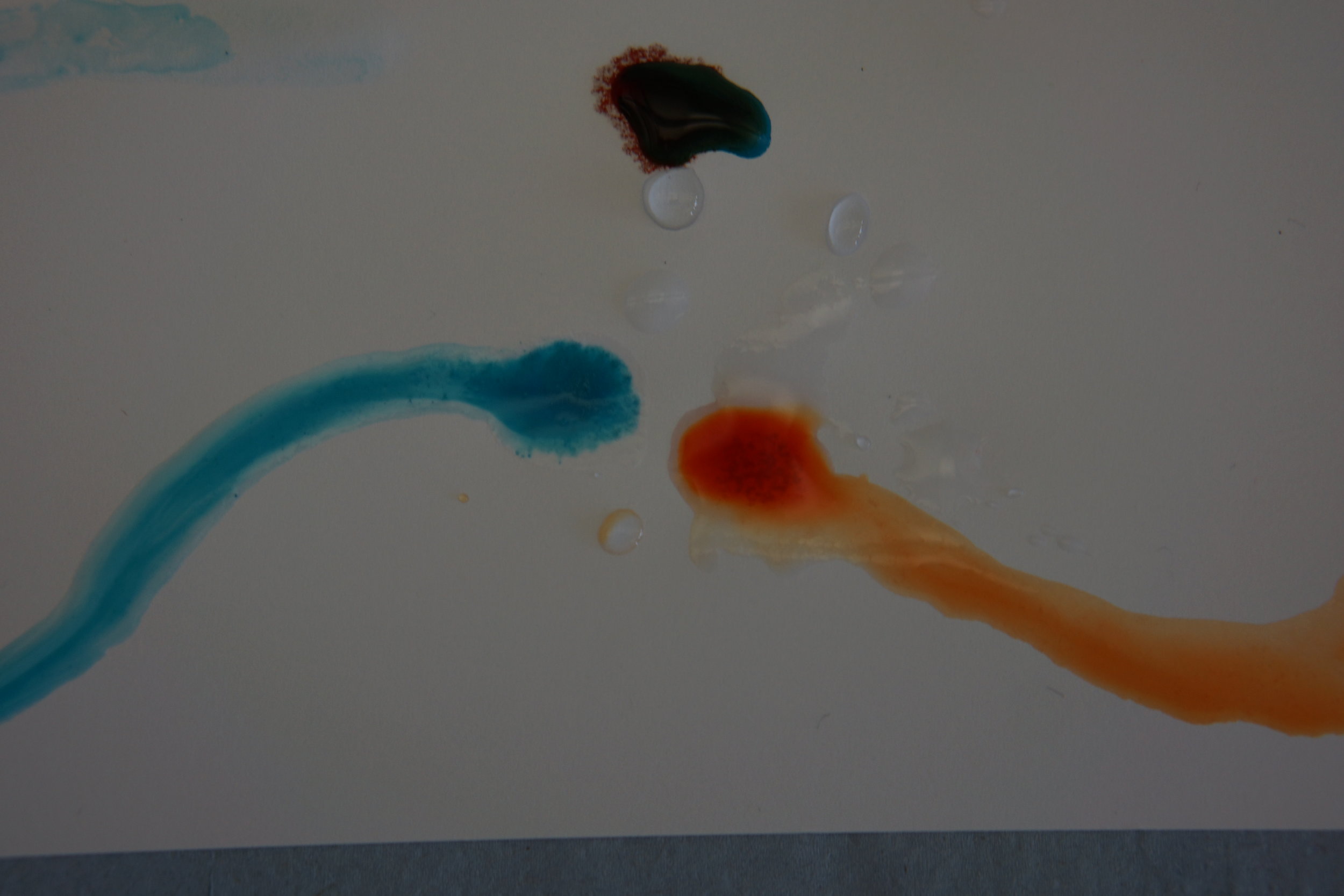
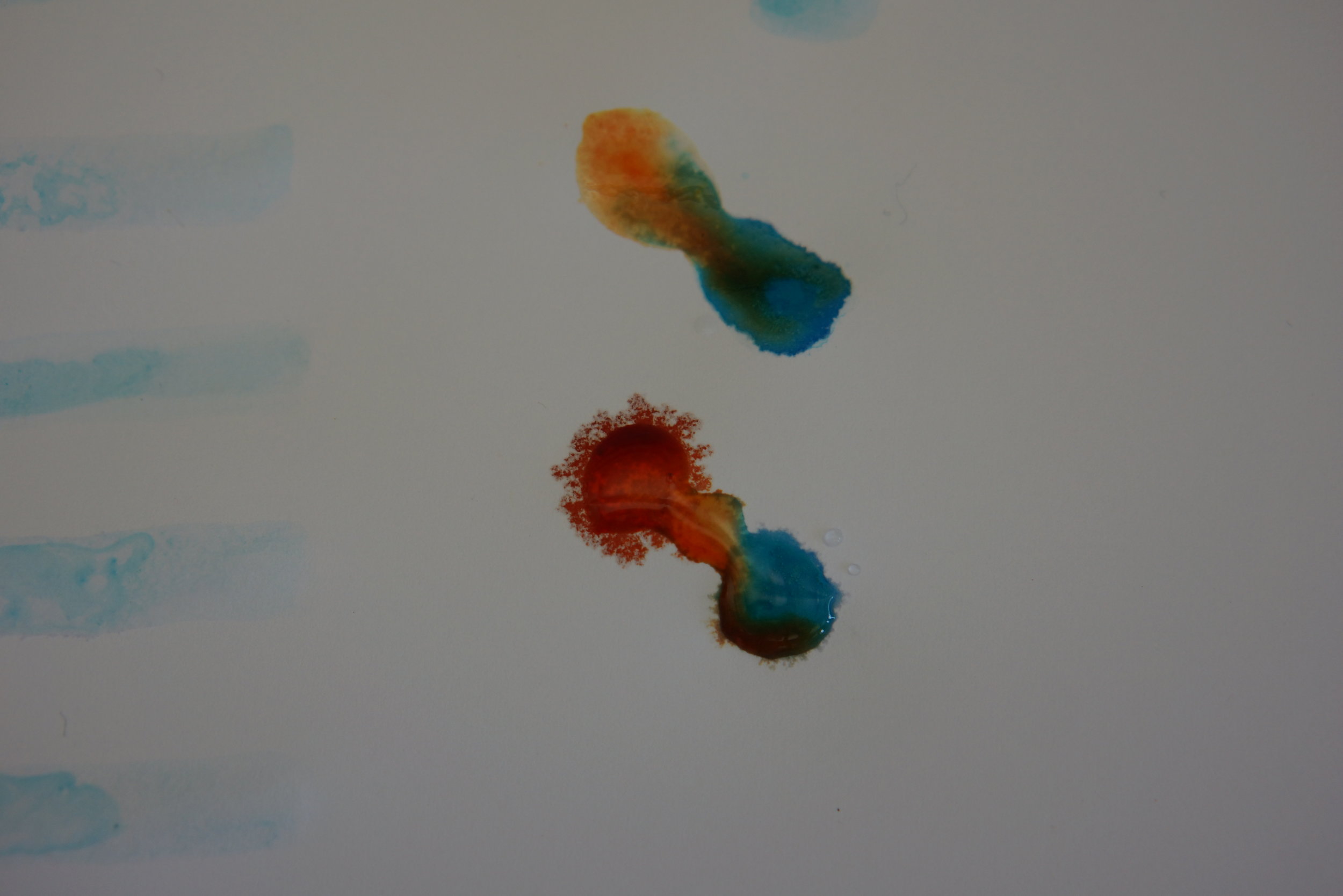
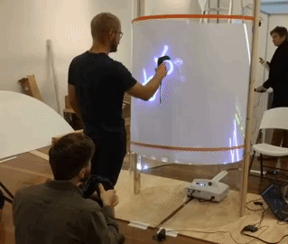
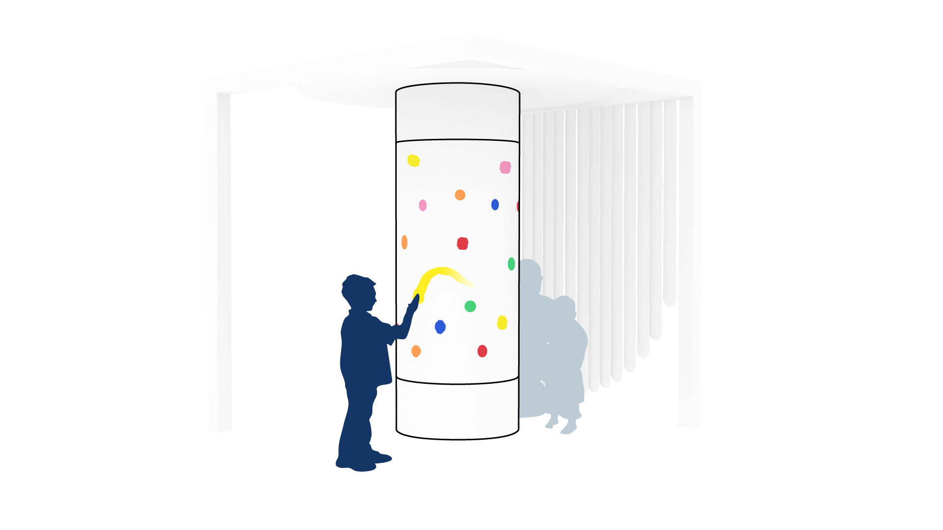
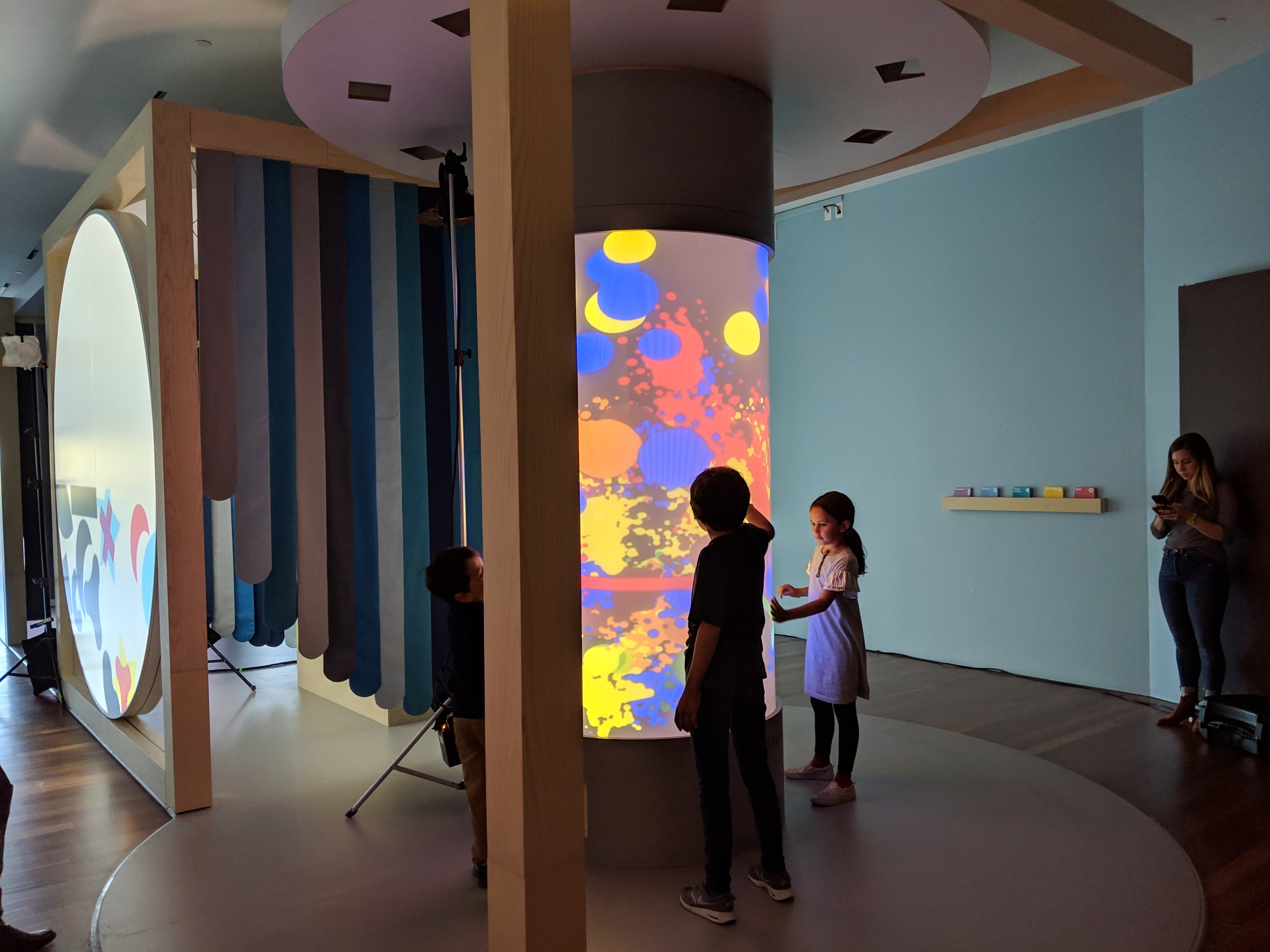
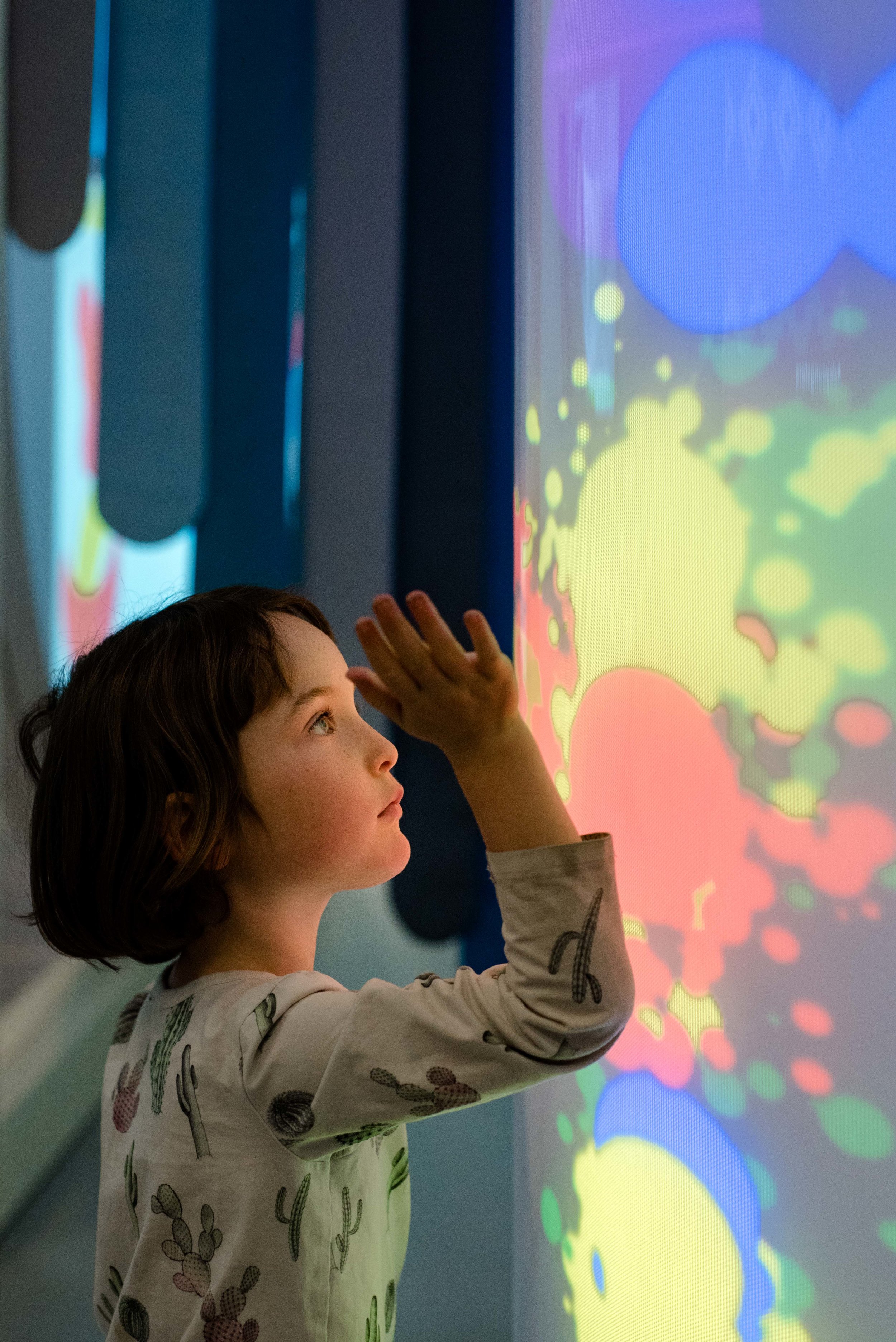
At the front of the room is the Color column, an interactive that lets children explore the basics of combining and mixing primary colors. Children can drag digital paint blobs with their hands around the entirety of the large touch-enabled column to see how they interact. Creative Technologist Adam Pere developed the entirety of the software for this core experience in openFrameworks, ingesting data from a FLIR machine vision camera.

Composition
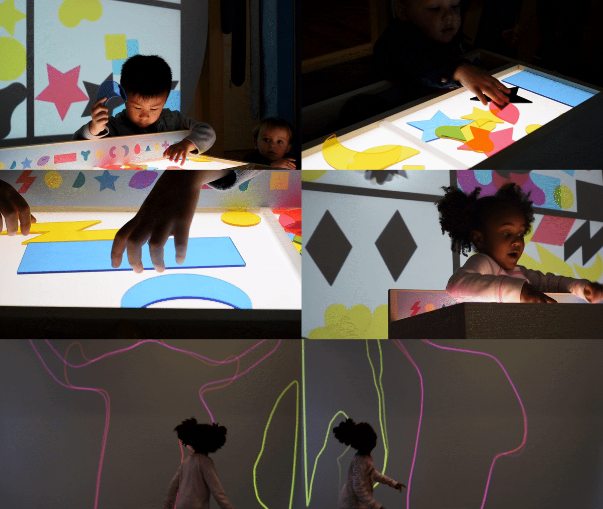
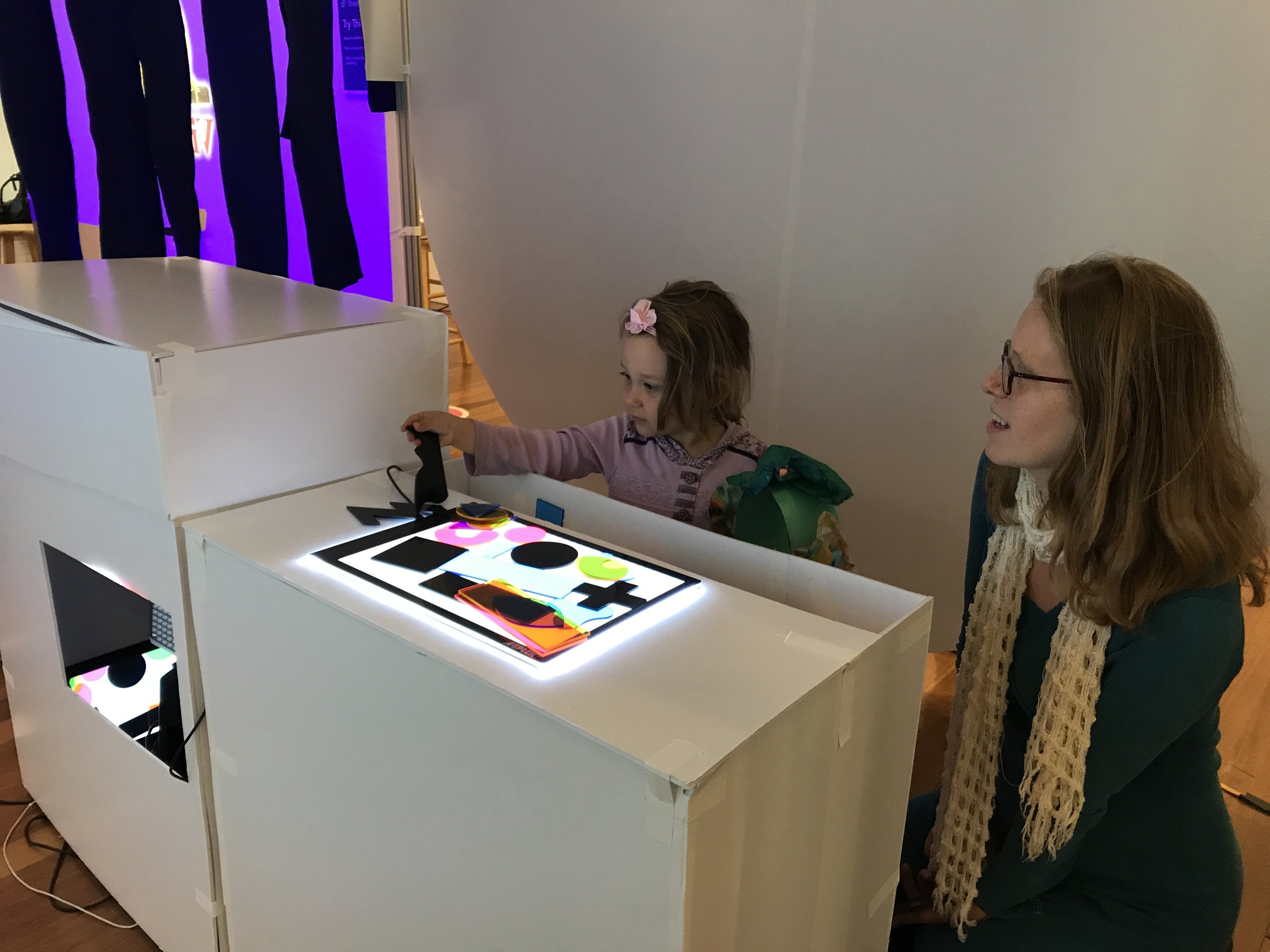
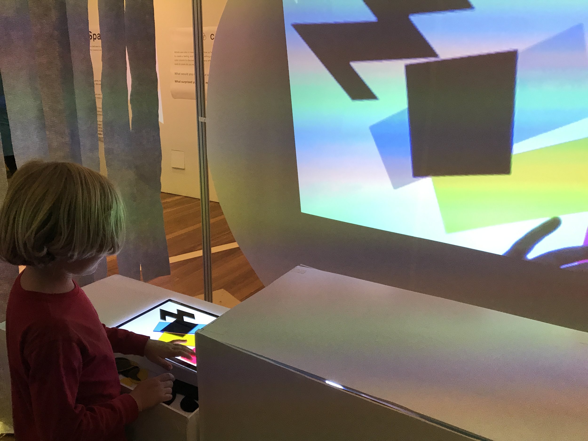
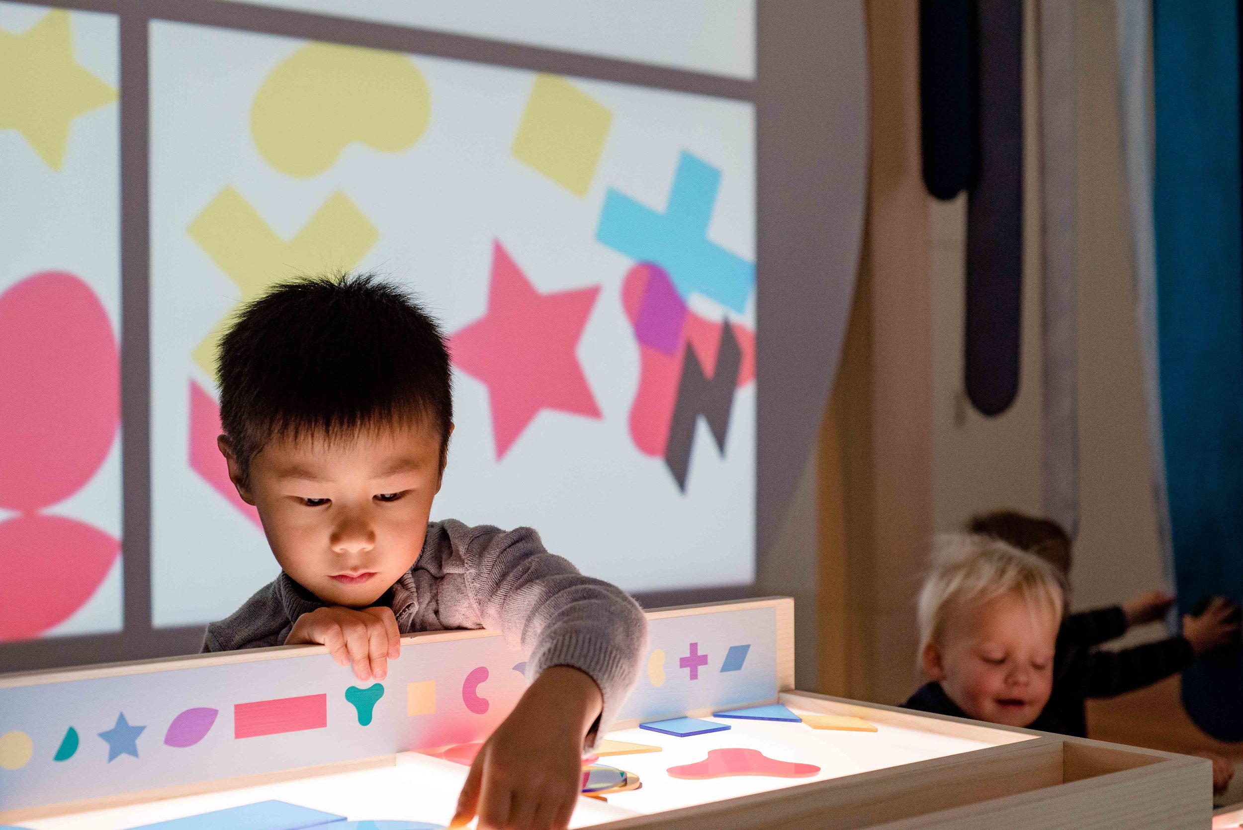
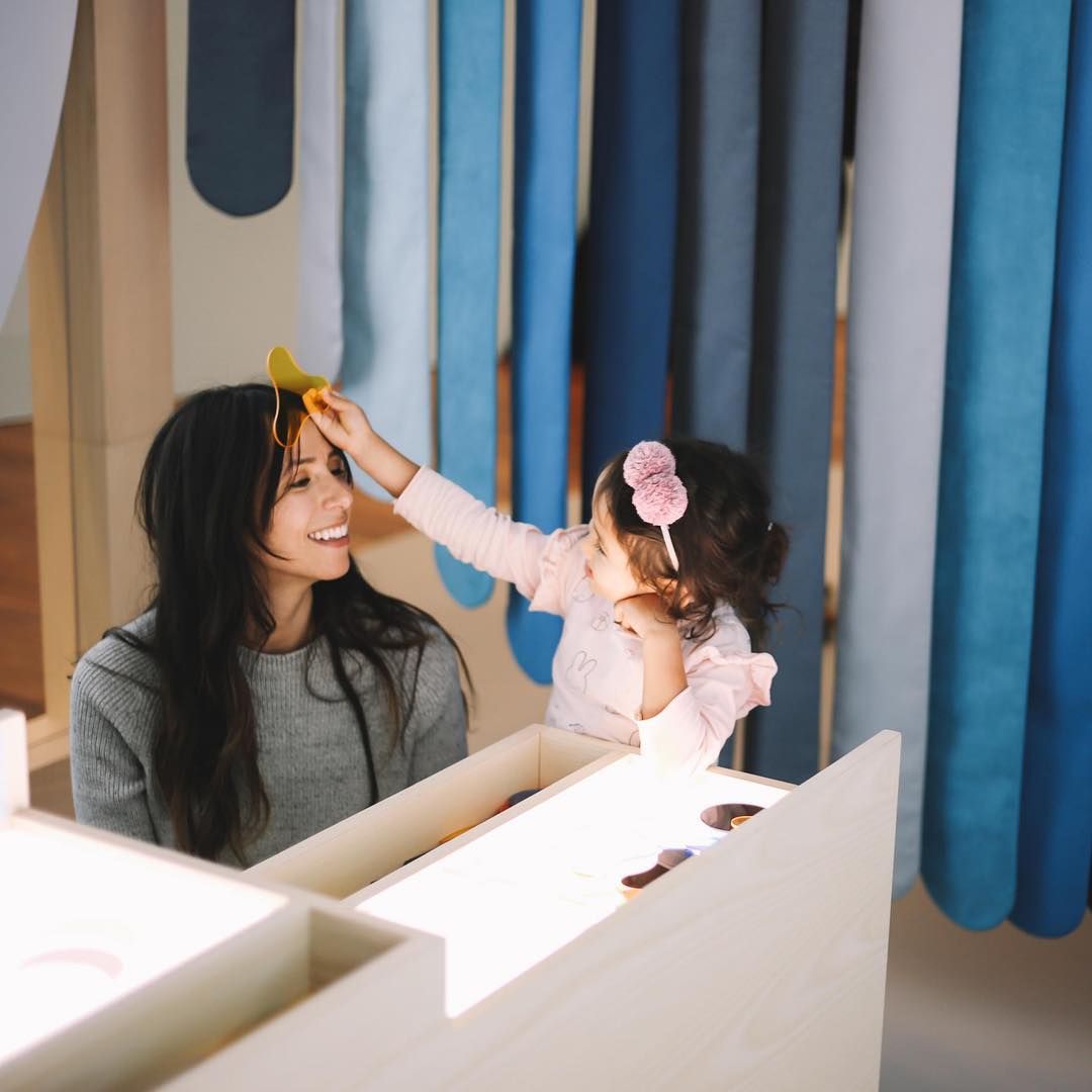
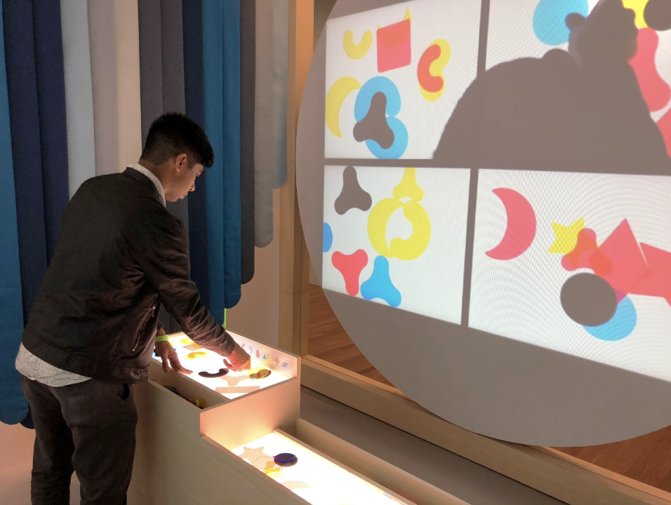
After the Color column comes the Composition module, where children can experiment with translucent acrylic shapes to learn about positioning and orienting components of a complete piece. The lit-up workstations they build on are captured and projected onto the interior and exterior walls of the module, allowing for both active users and passive onlookers to engage with the content.


Shape and Form
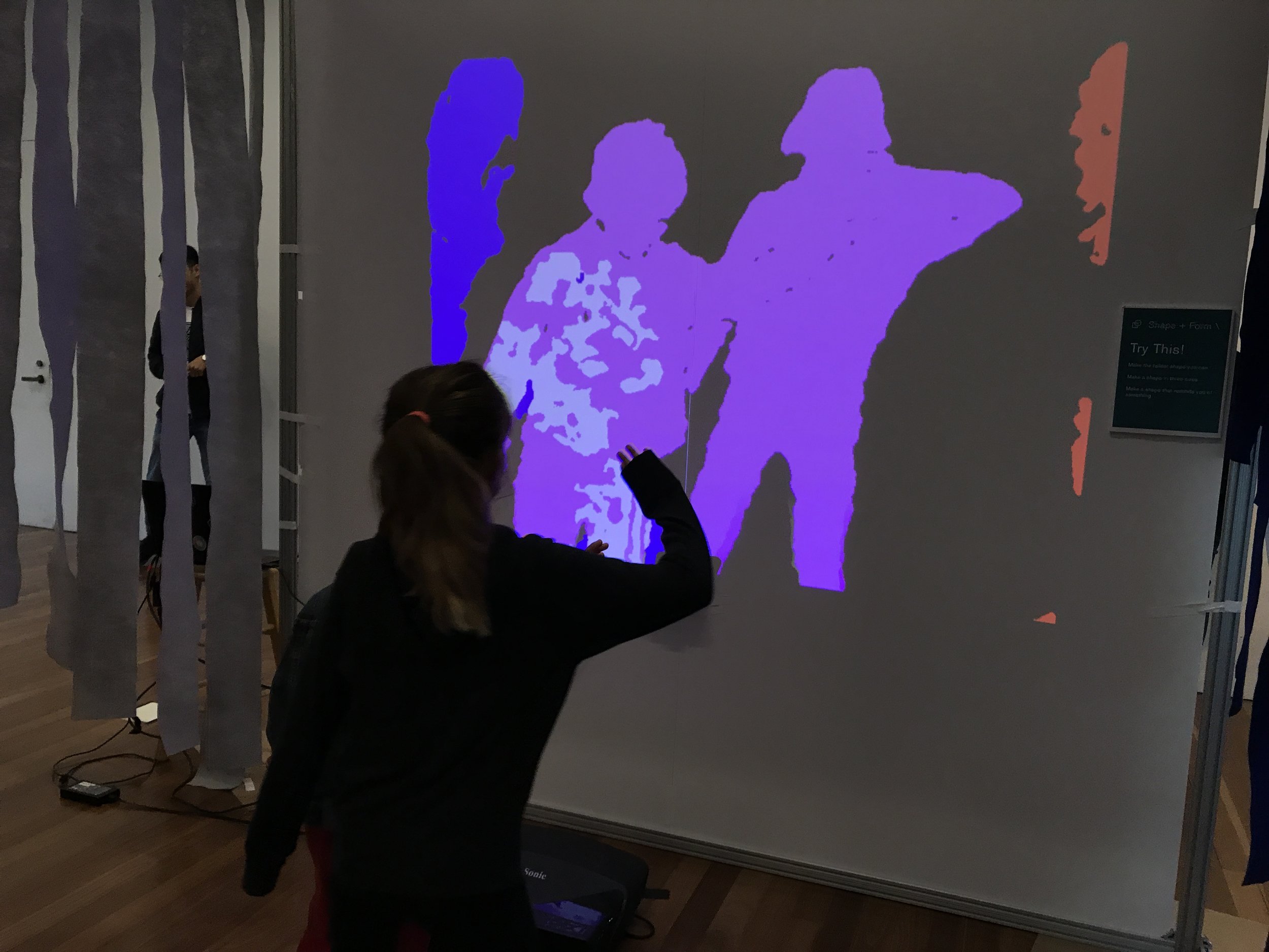
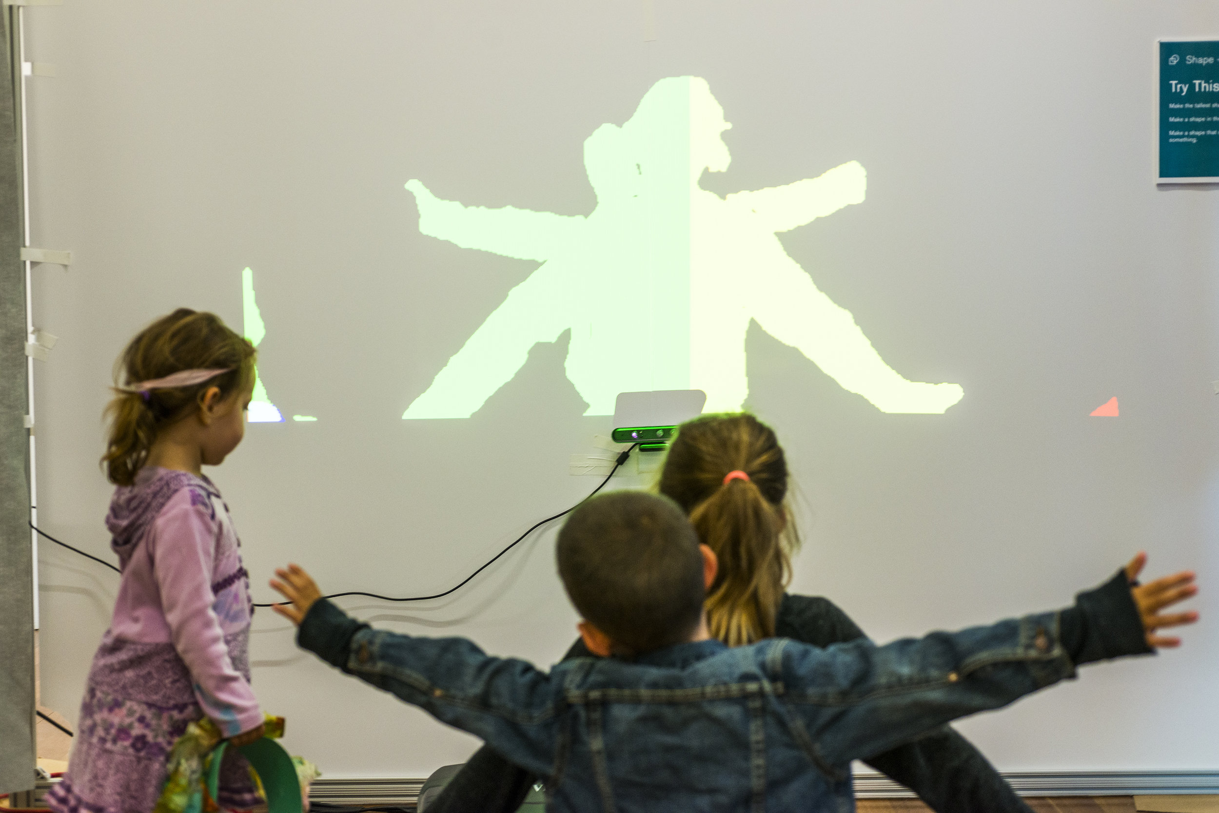
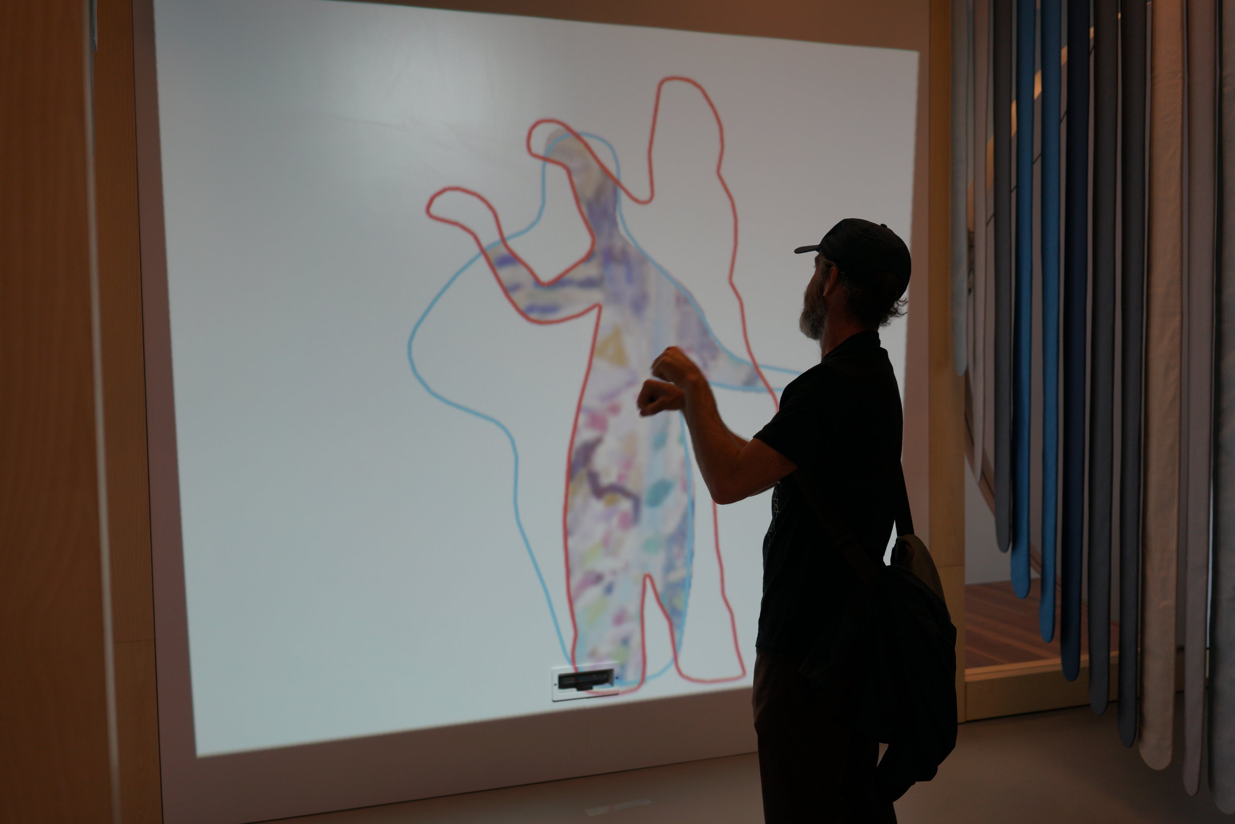
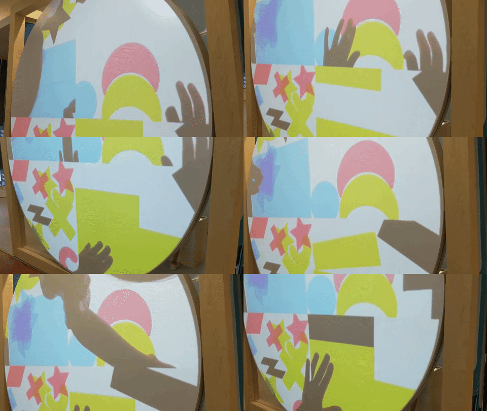
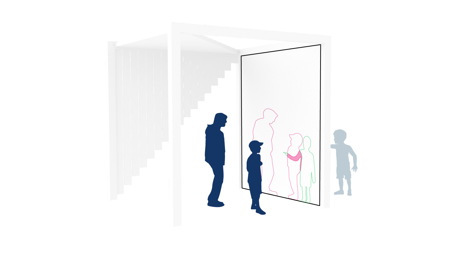
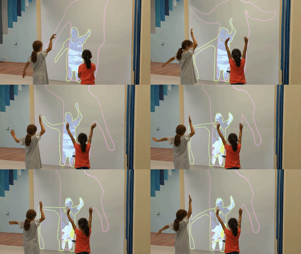
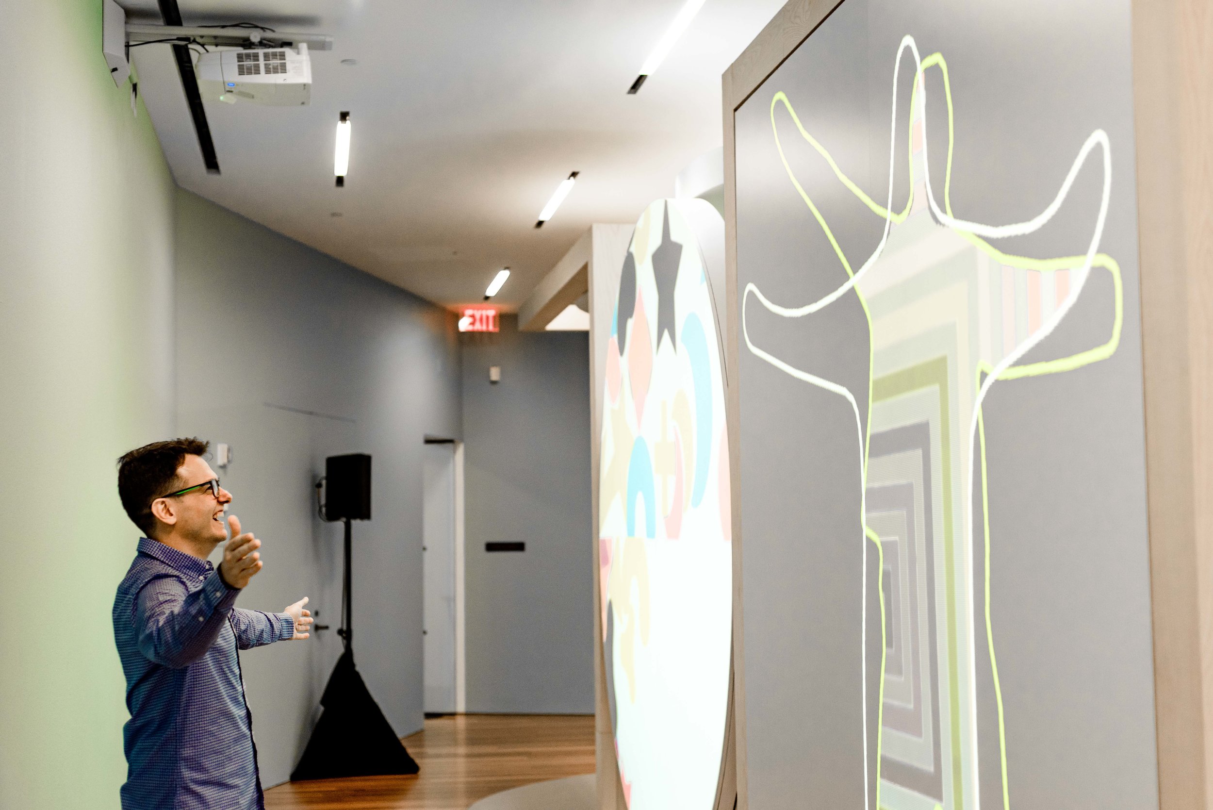
Transitioning out of the calming, introspective experience of Composition comes Shape and Form, a module that encourages children to get up and move/jump/dance around. Here, children’s silhouettes are picked up and projected onto both sides of a wall, allowing them to interact with each other in a magical mirror-type experience. When silhouettes from one side of the wall intersect with silhouettes from the other side, the overlapping area is filled with changing images from the de Young Museum’s collection. Additionally, if no one has walked past one of the sides after a certain amount of time, digital characters will appear on the screen to emulate the effect on people being on the other side.

Texture
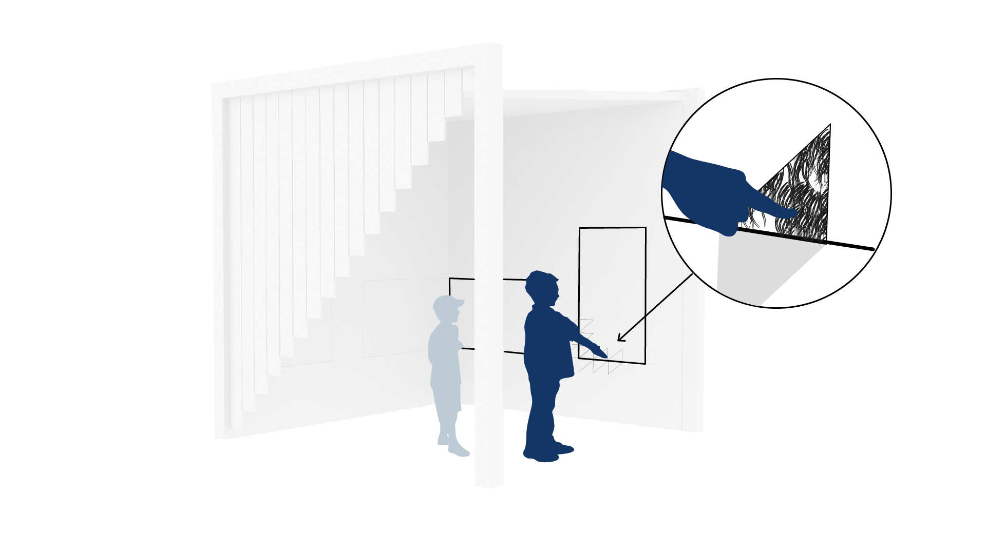
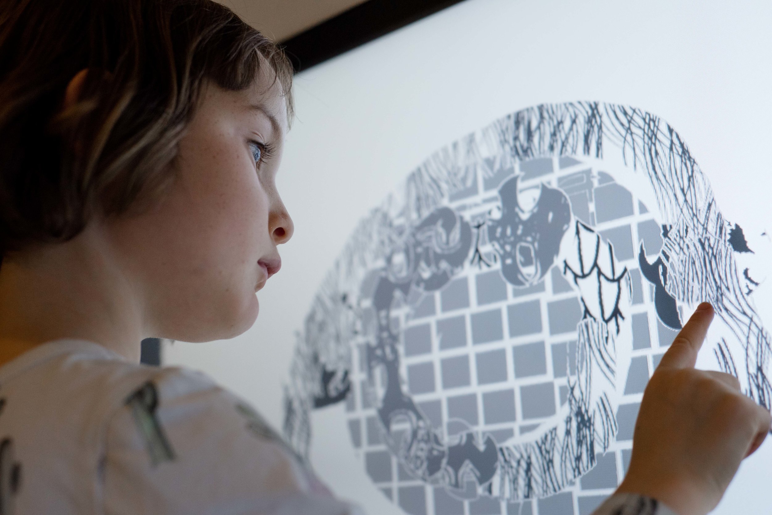
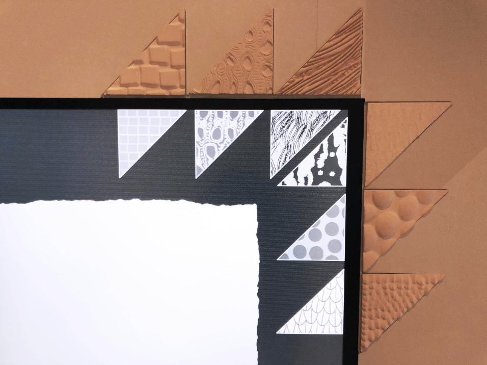
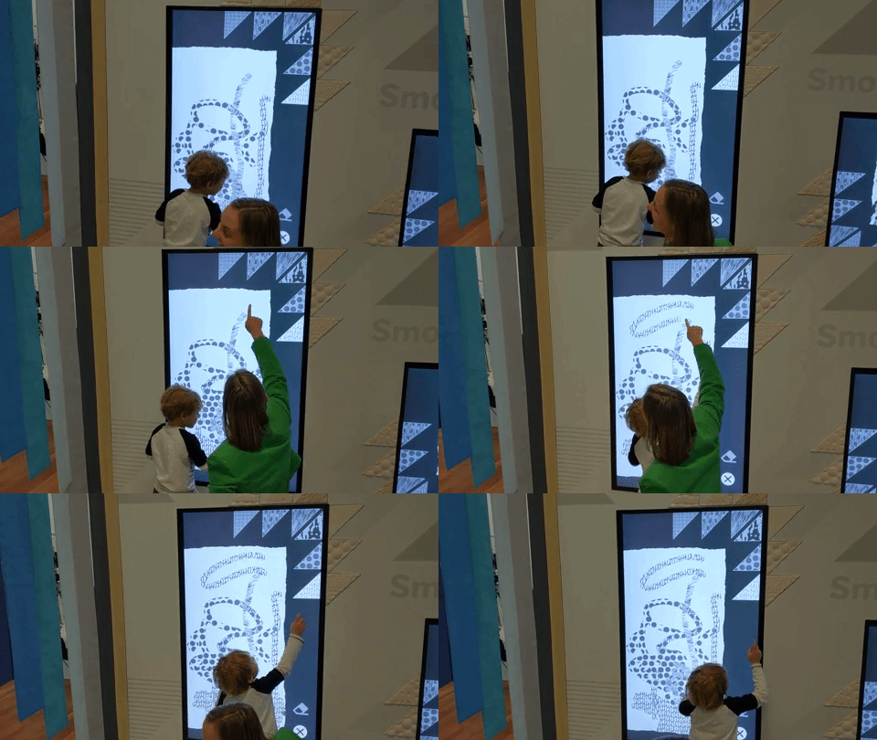
The Texture module features four large touchscreen interfaces that allow children to experiment with patterns and density. Referring to the physical experience of creating a charcoal rubbing, the module invites children to feel the differences between different textured tiles before choosing one to rub over.

Sculpture
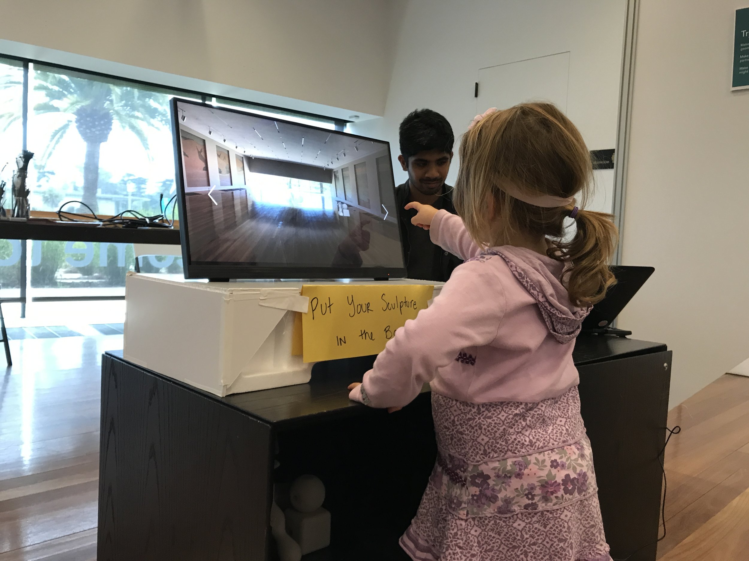
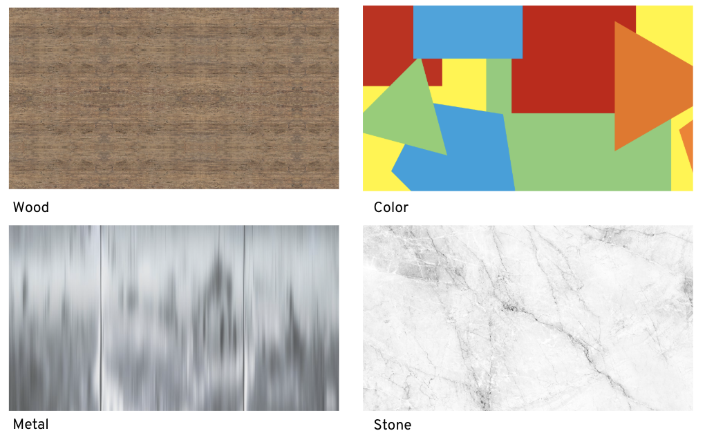
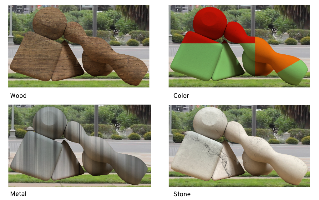
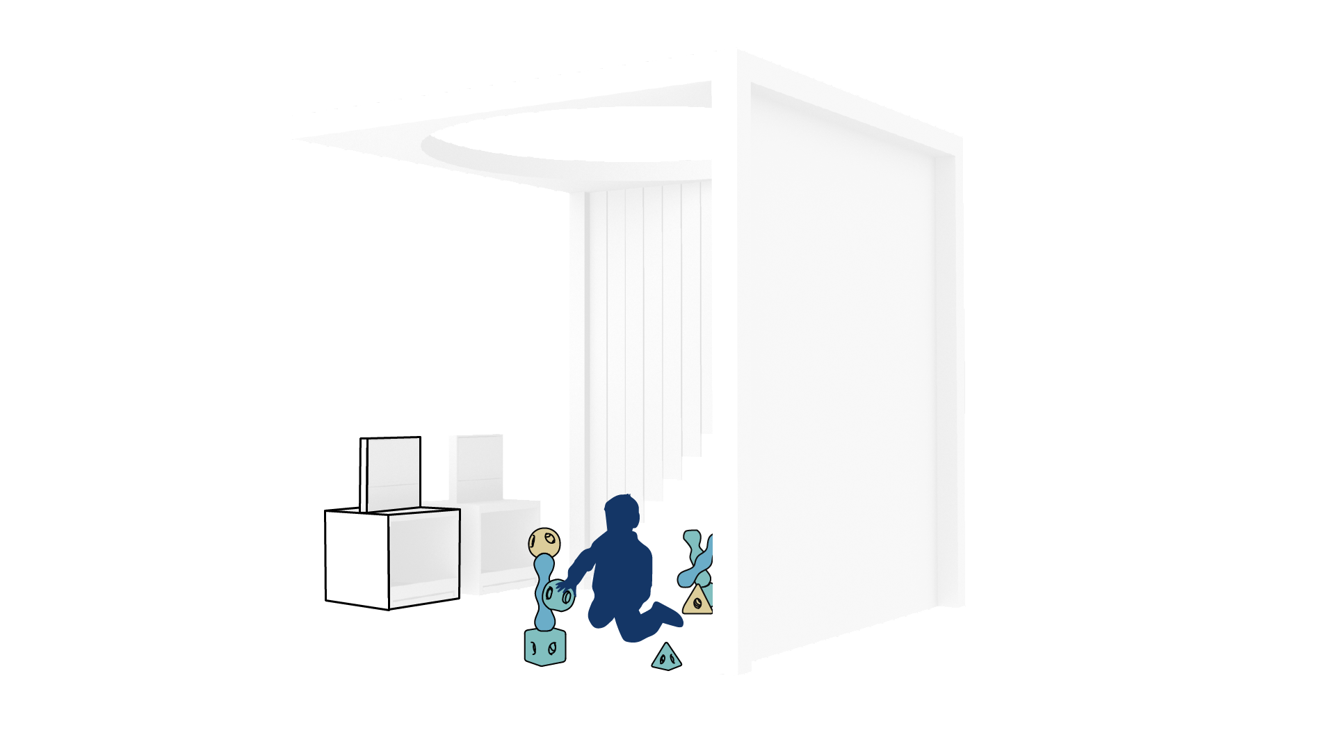
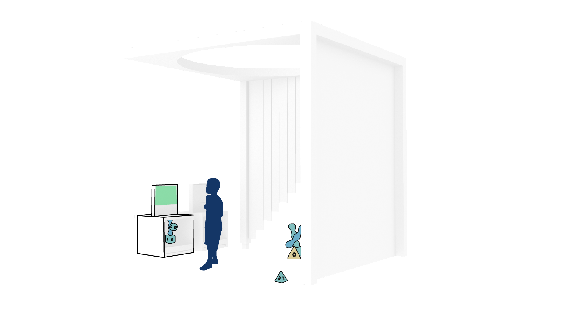
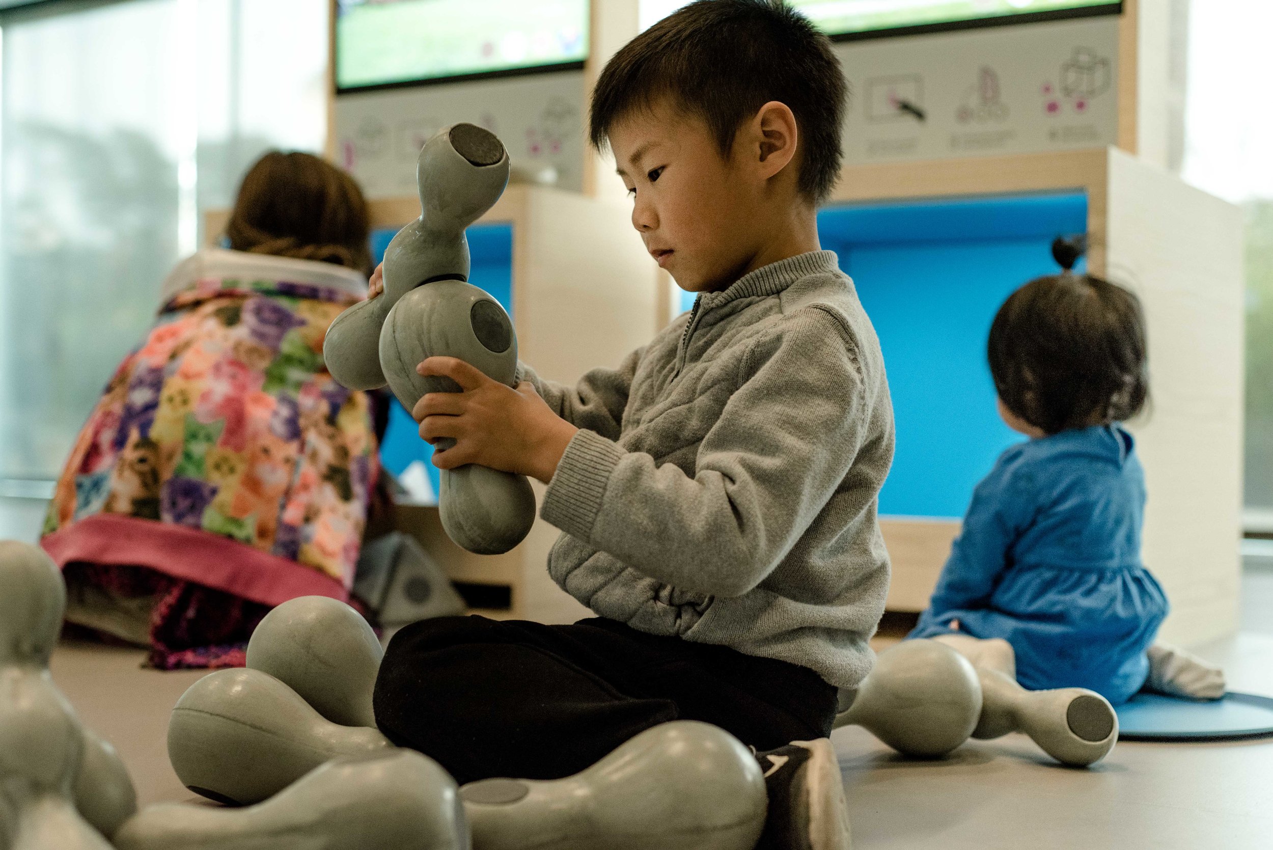
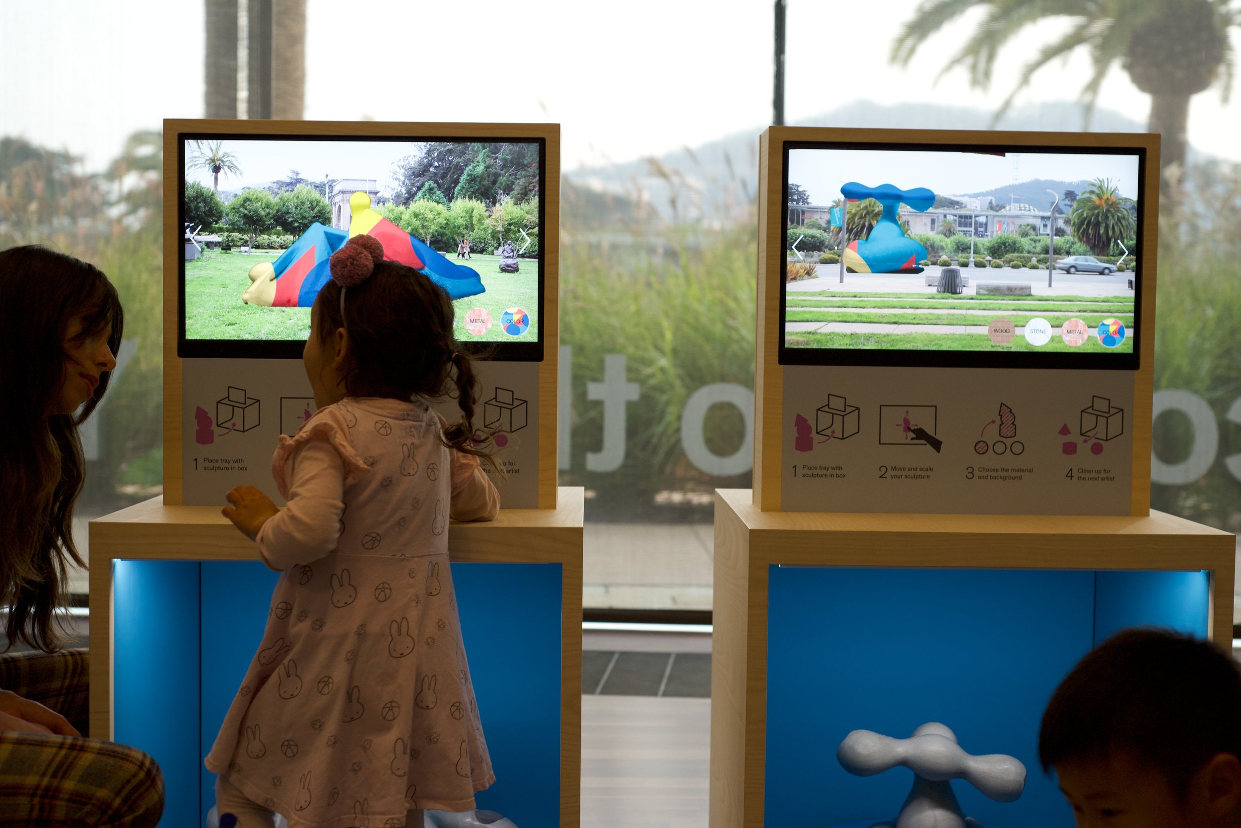
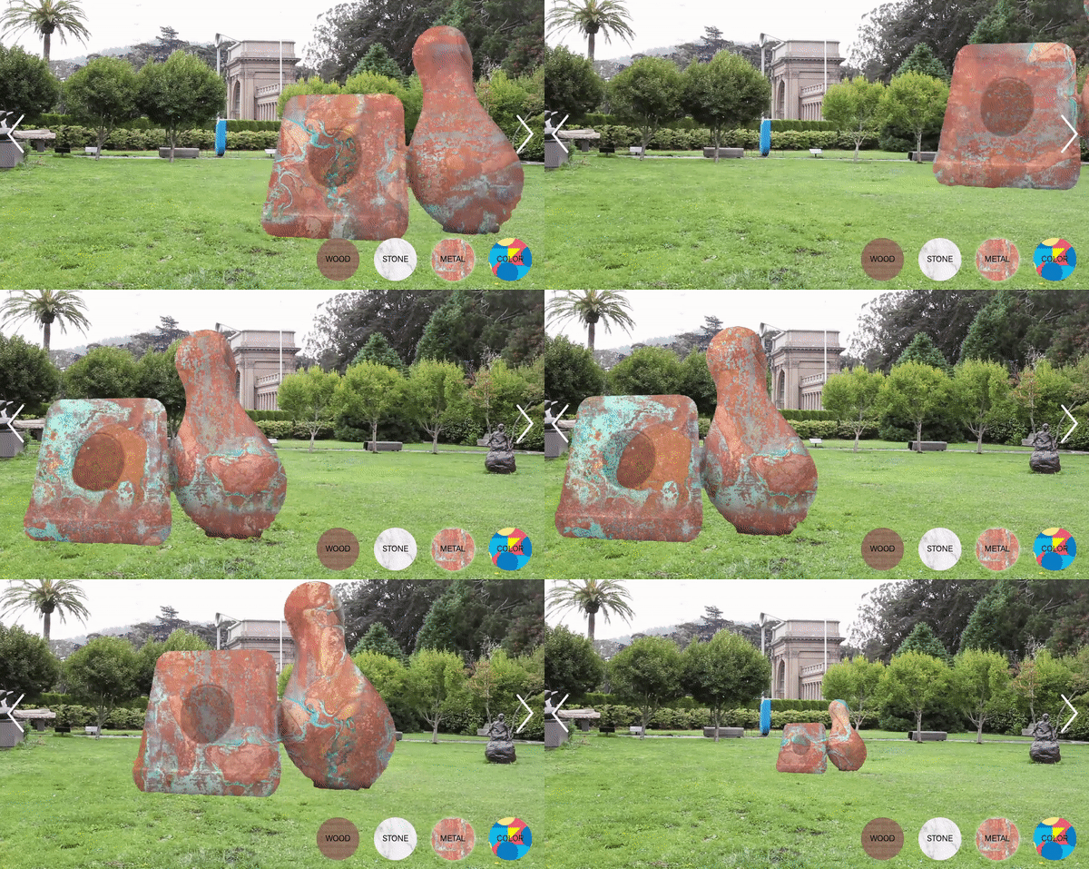
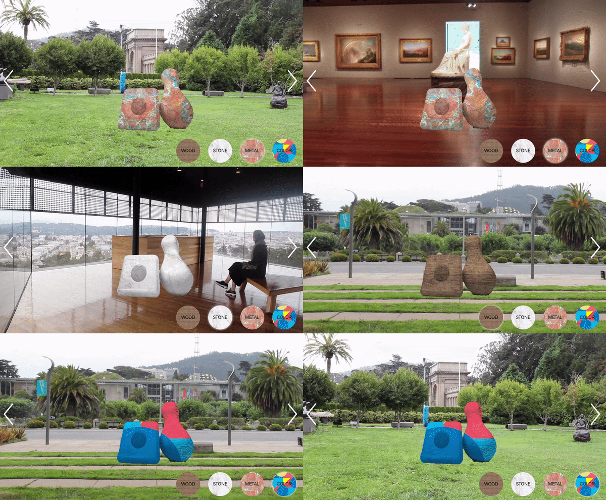
Finally, the Sculpture module lets children explore forms in 3D with magnetic foam blocks that snap together. Children are encouraged to place their completed sculptures into a capture station, where once inserted, allows them to change the scale and materiality of their piece, superimposed onto moving backgrounds from other locations in the de Young Museum.
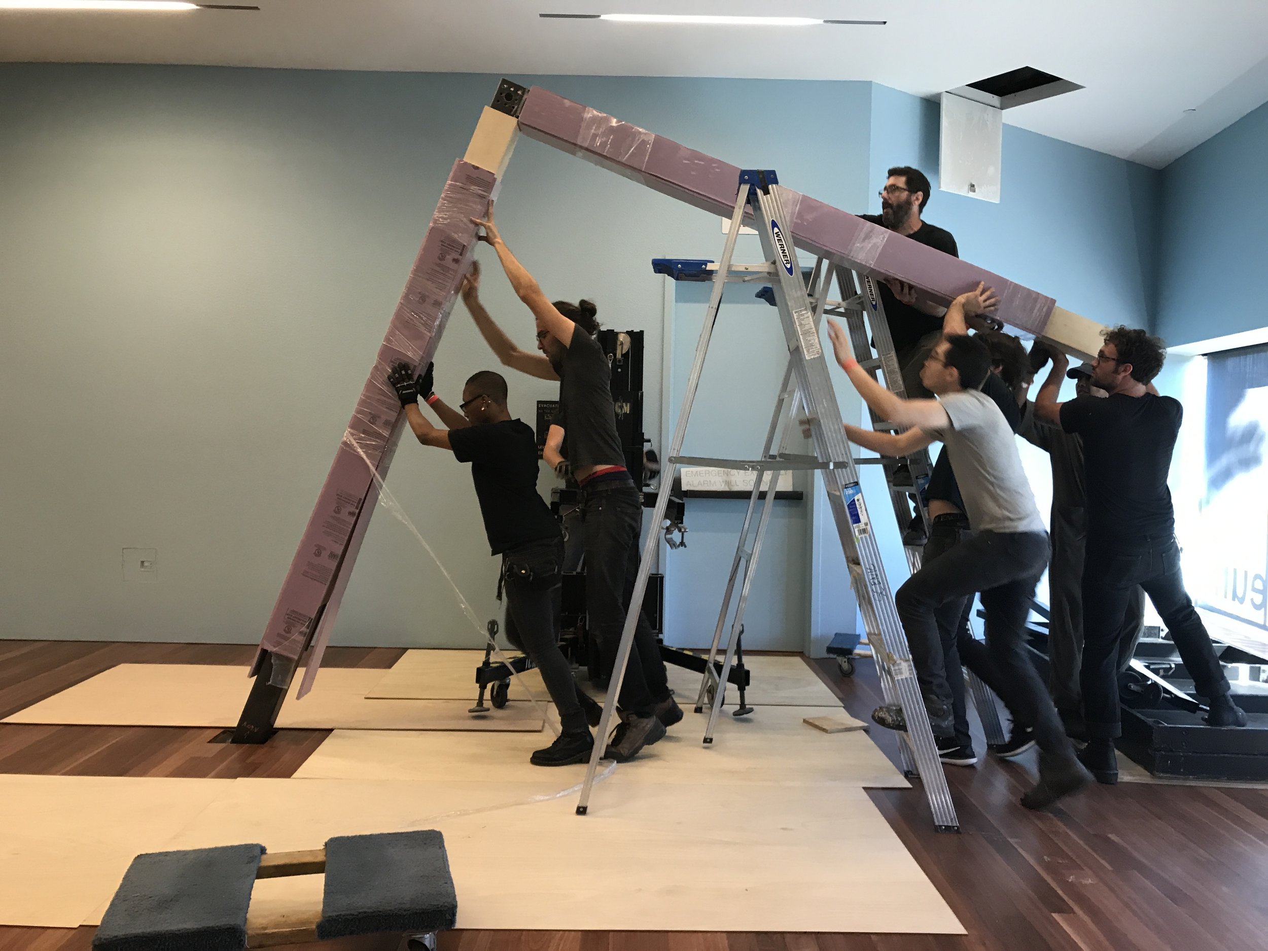
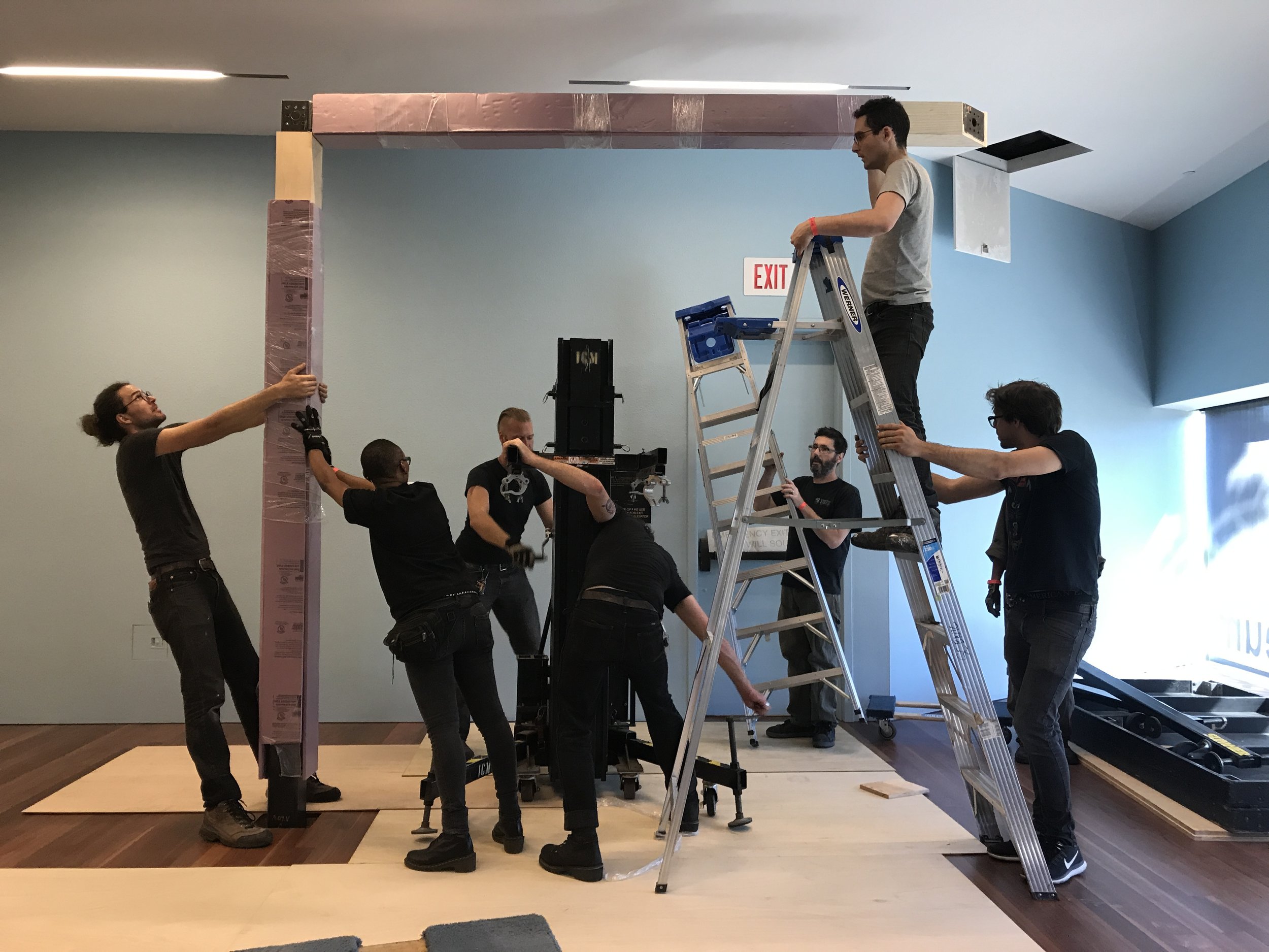
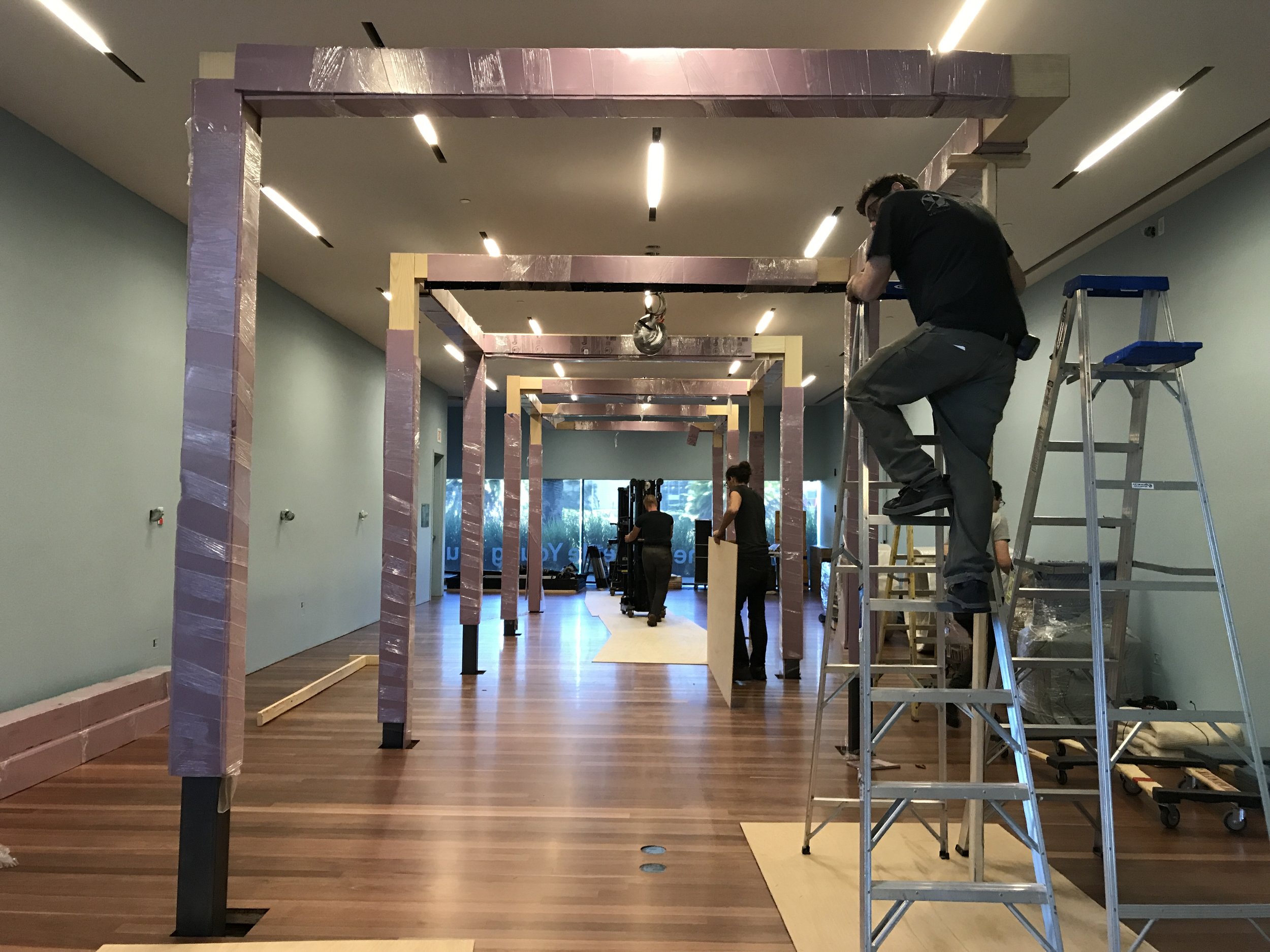
Below are some additional moments from user-testing, prototyping, and installation.
In addition to our conceptual design partner Fuseproject, we also worked closely with fabrication and installation partners Chicago Scenic Studios, Scenic Inc., 42 Design Fab, and Sterling Graphics. The Tellart team working on this project consisted of Kara Sanchez, Emily Leighton, Adam Pere, Bjørn Karmann, and myself.

